The Power of Infographics in Communication and Marketing
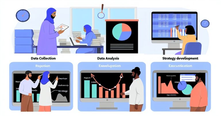
Infographics are an effective visual communication tool that translates complex information into easily understandable graphics. They use a combination of text, images, and data to convey a message to the audience.
Infographics are widely used across various industries, including healthcare, finance, education, and marketing. They help businesses to communicate their message to customers in a way that is easy to understand.
Infographics have become an essential part of modern communication and marketing strategies. In an age where attention spans are shortening and people want information quickly without having to read lengthy articles or reports, infographics offer a quick and visually appealing way to present information.
According to research by HubSpot, infographics are shared on social media 3x more than any other type of content. The importance of infographics extends beyond just social sharing; they can also help companies improve website traffic by increasing dwell time on their site.
By presenting complex concepts through visually engaging designs, infographics can keep visitors engaged longer than plain text alone would. This leads not only to improved brand recognition but also builds trust with your audience as it shows that you understand their needs for clear and concise information.
In this article, we will discuss tips and best practices for designing effective infographics that will help you communicate your message clearly while being visually appealing at the same time. The goal is not just creating something that looks good; it’s about effectively communicating the intended message using design elements that complement the content in a meaningful way.
Understanding Your Audience
Identifying your target audience
Before starting to design your infographic, it is crucial to identify your target audience. Understanding who they are and what they are interested in will help you create a design that resonates with them.
For instance, if you are designing an infographic for a fashion brand, your target audience would likely be fashion-conscious individuals who follow the latest trends. On the other hand, if you are creating an infographic for a healthcare organization, your target audience may consist of patients or healthcare professionals.
Knowing their interests, preferences, and needs
Once you have identified your target audience, it is essential to know their interests and preferences. This information will help you choose the right content and design elements to appeal to them.
For example, if you are designing an infographic for a pet food company targeting pet owners, it may be helpful to know that many pet owners prefer organic or natural products for their furry friends. In addition to interests and preferences, understanding the needs of your target audience is also crucial in designing effective infographics.
Ask yourself: What kind of information does my target audience need? What problems do they face?
What questions do they have? By answering these questions thoroughly during the planning phase of infographics design process —you can ensure that the content of your infographic is relevant and useful.
Tailoring your design to appeal to your audience
The ultimate goal of any good infographic is not just presenting data but also making sure that this data resonates with its intended readership. Therefore one must tailor an Infographic’s overall appearance- its layout colors as well as fonts- in such a way that it appeals specifically towards those readers; this requires making informed choices based on what we know about our intended audiences from our research conducted earlier on. For instance: The use of vibrant colors and playful fonts may be appropriate if the audience is young and creative.
On the other hand, a more formal and straightforward design may resonate better with a more mature or professional audience. By making careful choices in your color palette, typography, and overall layout of an infographic, you create an engaging visual story that is alluring to read.
Defining Your Message
Infographics are an effective way to communicate complex information in a concise and visually appealing format. However, to create a successful infographic, it is important to have a clear understanding of the message you want to convey.
This involves clarifying the purpose and intended audience of your infographic, as well as selecting key points that support your message. When defining your message, start by identifying the primary purpose of your infographic.
Are you trying to explain a concept or process? Are you presenting data or statistics?
Or are you promoting a product or service? Once you have determined the primary purpose, choose a clear and concise headline that accurately reflects the content of your infographic.
The headline should be attention-grabbing and informative while also being brief enough to fit into the limited space available. After choosing a headline, it is important to outline the key points you want to convey in your infographic.
These key points should support your overall message and be presented in an organized manner that makes them easy for readers to understand. Consider using bullet points or numbered lists to break down complex information into smaller pieces that are easier for readers to digest.
Choosing a clear and concise headline
The headline is one of the most important elements of an infographic because it is often the first thing readers will see. A clear and concise headline can grab their attention and draw them into reading more about your topic. When choosing a headline for your infographic, consider what will be most interesting or surprising about your content.
Some tips for crafting an effective headline include using action verbs, posing questions that pique interest, or making bold statements that challenge conventional wisdom. It’s also important not to mislead readers with sensationalist headlines that don’t accurately reflect the content of your infographic.
Outlining the key points you want to convey
Once you’ve clarified the purpose and message of your infographic and chosen a headline, it’s time to outline the key points you want to convey. The key points should be presented in a logical and organized manner that makes it easy for readers to follow along.
Consider breaking down complex information into smaller pieces that are easier for readers to understand. Use headings, subheadings, or bullet points to guide readers through the different sections of your infographic.
Avoid overwhelming readers with too much information or data, and focus on presenting only the most relevant information that supports your overall message. By defining your message, choosing a clear and concise headline, and outlining the key points you want to convey, you can create an effective infographic that communicates your message in a compelling way.
Choosing the Right Data
Infographics are designed to visually represent complex information and data in a concise and easily understandable manner. However, selecting the right data to include in an infographic is crucial for its success. In this section, we will discuss some of the best practices for selecting relevant data that supports your message within your infographic.
Selecting relevant data that supports your message
The first step in creating a successful infographic is defining your message clearly. Once you have identified the key point or message you want to convey through your infographic, it’s essential to choose data that supports that message.
Your audience should be able to understand the main idea behind your infographic by simply looking at it for a few seconds. If you’re designing an infographic about food waste, for example, it’s critical to select statistics and figures that support this issue.
You could use data on how much food waste occurs globally each year or how landfill space is being affected by food waste disposal. By supporting your main point with hard numbers, you can create a more compelling and informative infographic
Avoiding Data Overload or Irrelevant Information
While it’s essential to include enough information in an infographic to make it informative and engaging, using too much information can lead to confusion and overload. To avoid this problem, consider presenting only the most important aspects of each topic or idea you want to communicate through your design. In addition, including irrelevant information can also detract from the overall effectiveness of an infographic by muddying its focus.
It can cause viewers to become distracted by peripheral details instead of focusing on the primary objective of the design. Therefore, ensure every element included in your design aligns with its purpose so that viewers don’t get sidetracked while consuming content intended for specific communication.
Ensuring Accuracy and Credibility of Data Sources
Since infographics rely heavily on data, it’s essential to ensure that the information you present is accurate and verifiable. One way to achieve this is by citing credible sources for your data within the infographic itself.
When compiling data for an infographic, ensure that you have gathered information from trustworthy sources. This includes primary research, academic journals, government reports or agencies, reputable news organizations, and industry experts.
By doing so, you can guarantee that your audience trusts the information presented in the design. Selecting relevant data is a crucial aspect of creating an effective infographic.
You must choose only relevant facts and figures and avoid irrelevant information or data overload. Moreover, ensure all statistics are credible by citing reliable sources for each fact you present in your design.
Design Elements
Layout: Choosing an appropriate layout for your content
The layout of an infographic can make or break its effectiveness. An effective layout should be visually attractive and engaging while also being easy to read and understand.
To choose the right layout, consider the type of information you want to convey, the tone of your message, and the preferences of your target audience. A popular layout is a vertical design with sections or blocks that divide information into digestible pieces.
This allows readers to scan the infographic quickly, choosing which sections they want to read in more detail. Another important aspect of layout is the use of white space – this helps separate different elements within the design, making it easier for readers to follow along.
Color: Using color effectively to enhance readability and visual appeal
Color plays a vital role in infographics as it attracts attention and evokes emotion. It’s important to choose colors that complement each other well and align with your brand or topic. Be careful not to go overboard with too many colors as this can overwhelm readers.
Colors can also be used strategically to highlight important information or create contrast between different parts of the infographic. For example, using bright colors on a dark background can help text stand out more easily while pastel shades can create a softer look.
Typography: Selecting fonts that are easy to read at different sizes
Typography refers to font style and size and is another key element in designing infographics. To ensure readability, choose fonts that are legible at different sizes while still being visually appealing.
Consider using one font family for headings and another for body text; this creates hierarchy within your design without sacrificing consistency. Also consider using typography as a visual element by placing bolded words or phrases strategically throughout the design – this can emphasize key points or draw attention where needed.
Conclusion
Designing a successful infographic requires careful consideration of several design elements. Layout, color, and typography all play a key role in creating an infographic that is visually engaging while also being easy to read and understand. By choosing an appropriate layout, using color effectively, and selecting readable fonts, you can create an infographic that resonates with your target audience and effectively conveys your message.
Remember to keep your message clear and concise while presenting data in a visually appealing way. With these tips and best practices in mind, you’ll be well on your way to designing infographics that are both informative and visually stunning.