The world of graphic design is vibrant and colourful, with colour theory playing a pivotal role in creating compelling visual experiences. From brand identity to user interfaces, colour has the power to evoke emotions, influence perceptions, and guide viewers’ attention. This article will explore the fascinating world of colour in graphic design and provide actionable insights for designers looking to create effective, memorable strategies.
The Fundamentals of Graphic Design Color Theory
Understanding the basics of colour theory is essential for every designer. The colour wheel visually represents colours arranged in a circle, illustrating their relationships. Primary colours (red, blue, and yellow) are the foundation of the colour wheel. Secondary colours (green, orange, and purple) are created by mixing equal parts of primary colours, while tertiary colours are formed by mixing a primary colour with a neighbouring secondary colour.
Colour terminology is also essential to grasp. Hue refers to the purest form of color without any tint, shade, or tone. Saturation is the intensity or purity of a colour, and brightness or value indicates the lightness or darkness of a colour. Tint is a colour mixed with white, while shade is a colour mixed with black.
Colour Psychology in Graphic Design
Colours have the power to evoke emotions and influence perceptions. For example, red is often associated with passion, excitement, and urgency, while blue conveys trust, stability, and calmness. Yellow is linked to happiness, optimism, and energy; green signifies growth, freshness, and harmony; orange represents enthusiasm, creativity, and warmth; and purple symbolizes luxury, creativity, and spirituality.
Colour Theory for Designers: Essential Schemes and Techniques
Several colour schemes and techniques can be employed to create visually appealing designs. Monochromatic schemes use different shades, tints, and tones of a single hue for a cohesive and harmonious look. Analogous colour schemes consist of colours adjacent to the colour wheel, creating a sense of unity and balance. Complementary colours, on the other hand, are opposite each other on the colour wheel and create high contrast when used together.
Triadic colour schemes involve three colours evenly spaced around the colour wheel, offering a balanced yet vibrant effect. Split-complementary plans combine one colour with the two adjacent to its complement for a visually striking result. Tetradic colour schemes combine complementary colours, providing rich contrast and harmony when correctly balanced.
Complementary Colors in Graphic Design: A Powerful Tool
Using complementary colours in graphic design can create visual interest and emphasis, and they can make a design pop and draw attention to specific elements. High contrast between complementary colours can add energy and excitement to a design.
Ensuring sufficient contrast between text and background colours is also essential for readability and accessibility, especially for individuals with colour vision deficiencies. Pairing complementary colours can help enhance text legibility and make critical design elements stand out.
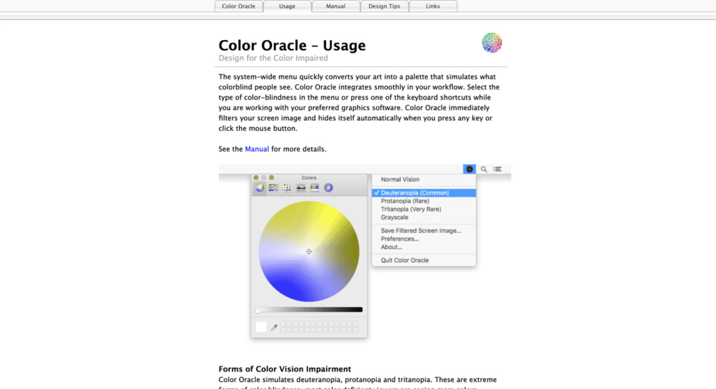
Colour Accessibility: Designing for Inclusivity
It’s essential to consider colour accessibility for users with colour vision deficiencies, such as colour blindness. Providing sufficient contrast and avoiding colour
combinations that may cause issues for people with colour vision deficiencies can help ensure your designs are accessible to a broader audience.
Online tools like Color Safe and WebAIM Color Contrast Checker can help designers choose accessible colour combinations. The WCAG 2.0 guidelines provide comprehensive recommendations for creating accessible web content, including colour contrast requirements.
Current Trends and Innovations in Color Theory
Stay current with design trends by following industry blogs, social media accounts, and annual colour predictions from sources like Pantone Color of the Year. Designers can also leverage AI-powered tools and data-driven insights to make more informed colour choices based on user preferences, cultural associations, and market trends.
Colour Management: Ensuring Consistency and Accuracy
Colour profiles help ensure colour consistency across devices and print materials by defining the colour space within which a design will be displayed or printed. Popular colour spaces include sRGB, Adobe RGB, and CMYK. Regularly calibrating your monitor and other devices can help maintain colour accuracy and consistency. Hardware colorimeters and software calibration tools can assist designers in achieving accurate colour reproduction.
Conclusion
Colour is a robust graphic design and branding tool, shaping perceptions, evoking emotions, and capturing attention. Mastering colour theory is essential for designers to create visually stunning and memorable designs. Applying the principles and techniques discussed in this article can elevate your design skills, enhance your brand’s identity, and leave a lasting impression on your audience.